Visual Thesis Interactive Metro Map

Problem
As part of my visual thesis, I conducted extensive research on various UX Design topics, specifically focusing on the accessibility and user experience of transport infrastructure. Given my aspiration to become a UX Designer, it was important for me to explore a field that would allow me to make a meaningful impact on people’s lives. I drew inspiration from my personal experience of using the metro in Copenhagen and comparing it to the London Underground. The discrepancies in the user experience and accessibility of both transport systems were quite apparent, with the Copenhagen Metro standing out for its attention to detail in terms of accessibility and traffic flow. I was intrigued to investigate the reasons behind such differences in transport infrastructure design across countries.
Insight
My research suggested that there is a significant imbalance in how different countries prioritize accessibility in their transport infrastructure. While some countries, such as Denmark, have made substantial progress in implementing accessibility features in their public transport systems, others have been lagging behind. This disparity often stems from a lack of investment, awareness, and consideration of accessibility needs, leading to exclusion and discrimination of people with disabilities or mobility issues. Through my research, I aimed to highlight the importance of designing inclusive and accessible transport infrastructure that caters to the needs of all users, regardless of their physical abilities.
Solution
In order to create a truly unique and engaging visual aspect for my thesis, I knew I had to do something different. At the same time, I wanted the experience to be familiar and intuitive, like using a map. Since my thesis was the main focus of my work, I wanted to find a way to incorporate it fully into the experience so that people could listen to the interesting information that I had discovered.
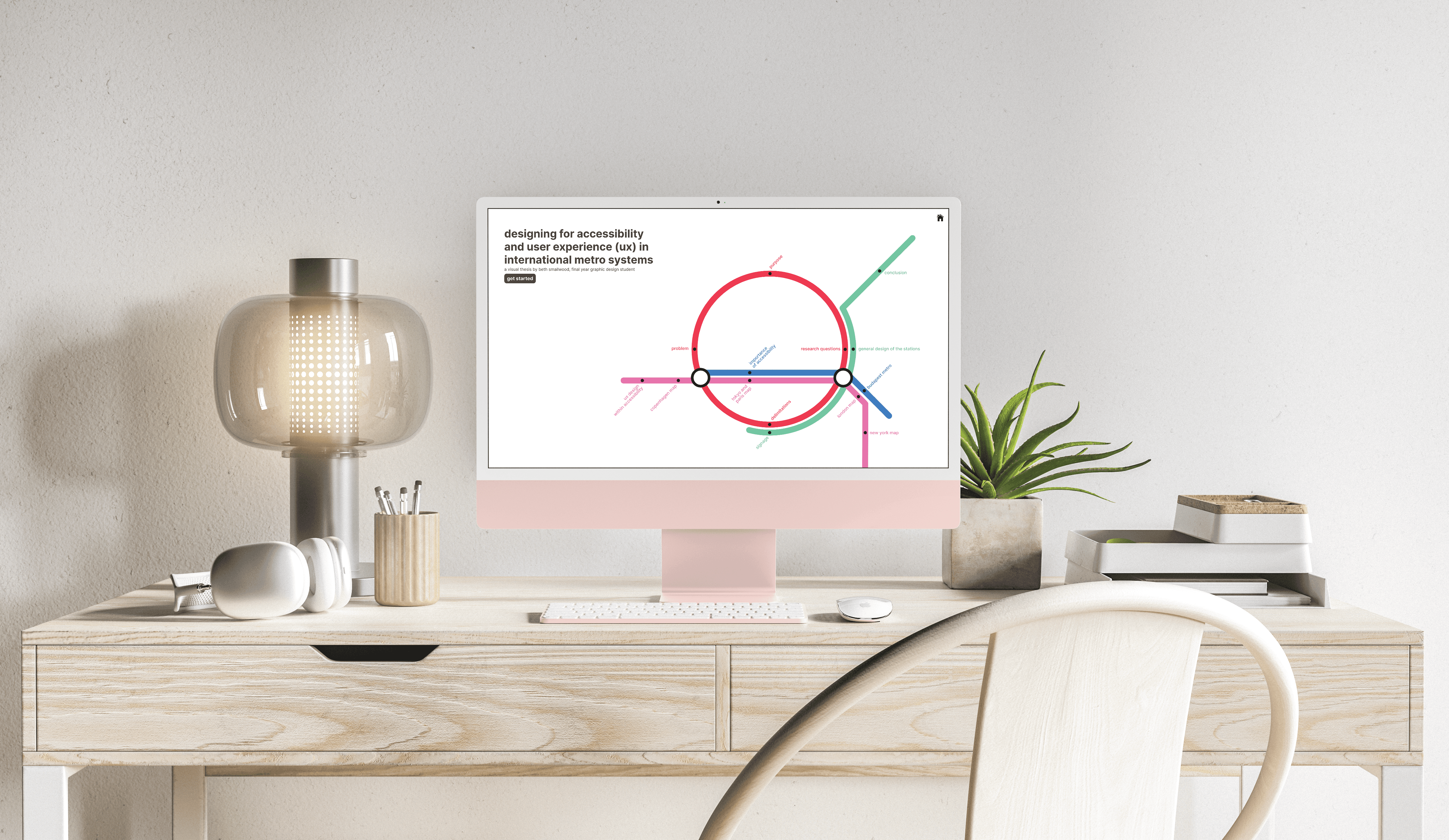
To create an interactive and engaging experience for my visual thesis, I came up with the idea of an interactive metro map that serves as a guide to the different chapters of my thesis. Each chapter is represented as a location on the map, and I divided the paragraphs from my thesis into these locations. You can click on the different locations randomly by clicking on the dot from the home map or use the next buttons to guide you through each location. I structured the paragraphs in such a way that you can read one part without needing the other, but if you go through all the sections, you gain a better understanding of the topic, like watching a trilogy of movies. While it may take some time to go through all the sections, I believe the interactive experience is worth the effort.
To make my interactive map accessible to the visually impaired and provide a distinctive user experience, I added audio files with controls. For those who prefer reading or are hearing impaired, I also included a transcript. The map design ensures seamless transitions between each section, mimicking the fluidity of moving across a real map. My inspiration for this project came from the interactive map style in New York.
In summary, the aim of my project is to create an interactive and accessible experience for users to engage with my thesis topic on the accessibility and user experience of transport infrastructure. By including audio files and transcripts, you hope to make the map accessible to a wider range of users. Additionally, the onboarding experience will guide users through the map and help them easily access the information they are interested in. Overall, my project aims to provide a unique and engaging way for people to learn about the important topic of transport infrastructure accessibility and user experience.